We can deal with data issues and make our visualization more interactive by adding filters. In this section we will deal with the message at the bottom of our map that says 3 unknown. We will also add an interactive Category filter.
Learning Objectives
- Exclude data using filters.
- Create interactive filters for users.
What is a Filter?
At its most basic level, a filter allows us to specify what values to include or exclude in our visualization. This is how we can deal with many data issues, like null (non-existent) values. It is also possible to add an interactive filter. This kind of filter (generally) does not add or remove anything from the visualization to start with, but viewers of the finished project can use the filter to specify or exclude values temporarily.
For example: We could add a filter to include only the United States in our visualization, meaning only mods created in the US would be shown. Alternatively, we could add a generic country filter. A user could then choose the United States to only see mods created in the US, but they could also choose any other country and would be able to go back to viewing all of the countries at any time.
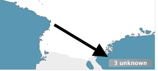
Dealing with 3 unknown
Since the moment we added Country to the worksheet, this "3 unknown" message at the bottom of the map has been bothering me.
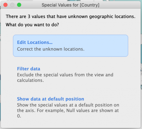
- Click on the message. A dialog box will pop up with three options: Edit Locations..., Filter data, and Show data at default position.
- Choose Edit Locations.... Even if we do not edit anything, this option allows us to see what values are causing an issue.
- There are two columns here, with the data we are most interested in the top rows. The first three values in the Your Data column (England, Not specified, and Wales) are listed as Unrecognized in the Matching Location column. Tableau only recognizes the United Kingdom, so we will need to tell it to map England and Wales as part of the UK. If we click on the box saying Unrecognized and start typing United Kingdom, a drop down will pop up with various options, including the one we want. Select this for both England and Wales.
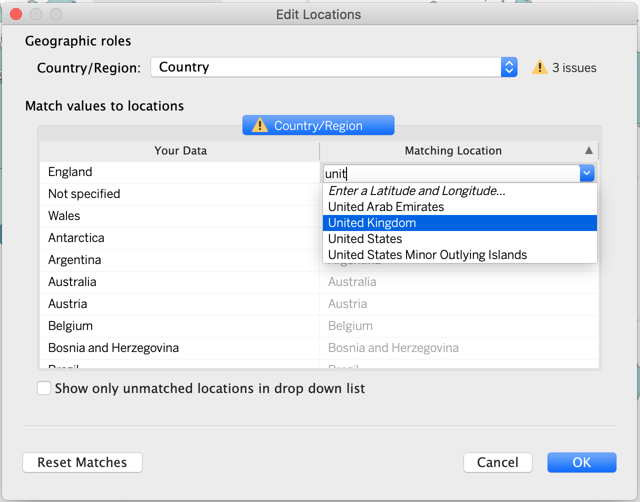
- Click OK.
Note that we did not actually change the data - the Country fields for these records will still state England or Wales, but now Tableau will know how to map these values. This would not be a solution for cleaning messy data. A good option is OpenRefine, a free, open-source tool that makes it easy to investigate and clean data. OU Digital Scholarship maintains an OpenRefine tutorial if you are interested.
Removing Not Specified Country Values
There is not a good value to map our unspecified countries. We do want to remove them, however, because they are being counted as a country in their own right. This can interfere with our visualization. The easiest way to see this is to hover over the United States and see that it is ranked #2 for number of mods although it should be ranked #1. This filter is to solve a data issue, so it will not need to be interactive.
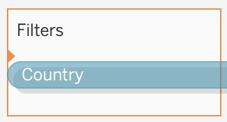
- Locate Country from the Data sidebar.
- Drag it onto the Filters shelf. Pay special attention to the small orange triangle that appears on the edge of the box. This, in addition to the orange outline, indicates that Country will be added.
Note: An alternative to this would be to find Country on the Marks shelf, right click, and choose Filter...
- The popup that appears will default to the General tab with Select from list chosen. In the list, select only the value for Not specified. If necessary, click the None button first to deselect all values.
- Then click the checkbox for Exclude. The Summary Selection should read: Excluded 1 of 69 values.
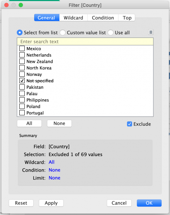
- Click OK.
Note: An alternative would be to select every value except for Not Specified and to leave Exclude unchecked. Both options would have the same result.
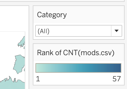
Adding a Category Filter
Now we can add an interactive filter that will allow users to view the distribution of mods for the various mod categories. This kind of filter will not make any changes to our data. Instead, users will be able to manipulate the finished visualization themselves.
- Locate Category from the Data sidebar.
- Drag Category to the Filters shelf.
Make sure you can see the orange triangle we noticed earlier when adding Country. If you do not, that may be because Tableau thinks you want to replace the Country filter with Category. The solution is to make sure not to drag Category on top of Country.
- In the popup, choose Use all instead of the default Select from list.
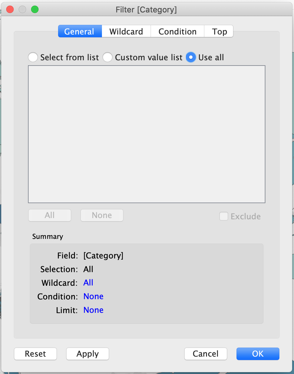
- Click OK. This will not change anything on our map.
- Right click on Category from Filters and choose Show Filter. This will display an interactive filter on the worksheet.
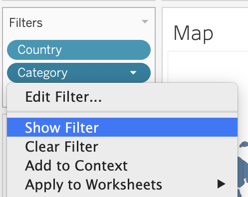
By default, this filter will be a long list of checkboxes. Note that the first option is (All) and that the second is Null.
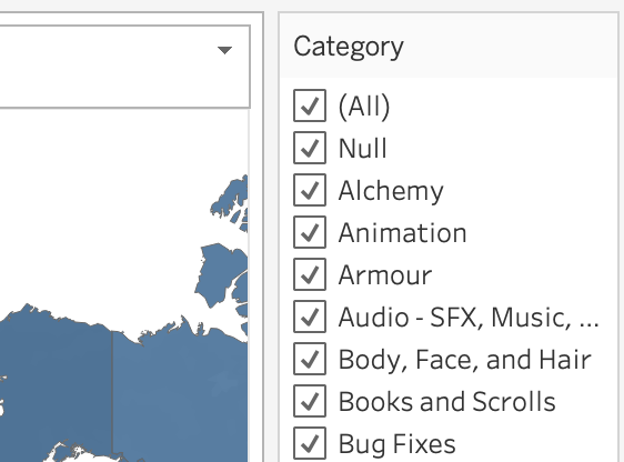
Removing Null from the Category Filter
The second option on our new filter is Null, which is a placeholder for a non-existent value. As a category, null is meaningless, so it would be best to filter it out. More than that, we do not want to include this as an option in the interactive filter provided to users. This is a data issue that should be taken care of behind the scenes. Unfortunately, since we already have a category filter, removing null values (without changing that filter) is a little bit complicated. Simply unchecking the box on the filter would still leave it visible to end users, so we have to add a second category filter. Dragging Category to Filters will not accomplish this: We will be able to edit our current filter, but we will not be able to add a second filter for the given dimension. Instead, we will have to use a workaround.
If you are curious, there are two mods with no value for category. This was not an error in data collection: I looked up the mod pages for those two mods, and somehow they do not have categories.
- Right click on Category under Dimensions.
- Choose Duplicate.
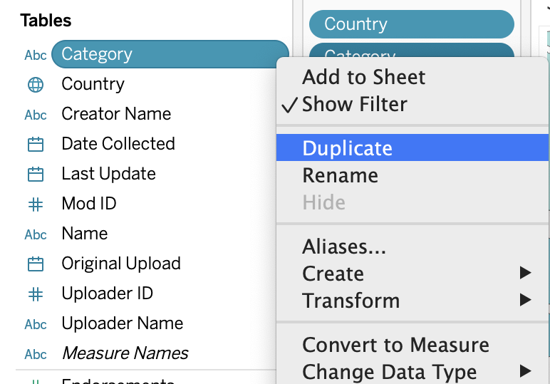
- Right click on the duplicate Category (copy) and choose Rename.
- Change the name to Category (null filter). This describes how we are using the dimension and will make its purpose obvious when we look at our current filters.
- Now drag Category (null filter) to the Filters shelf.
- Choose only Null and click the Exclude checkbox. The Summary Selection should read: Excluded 1 of 60 values.
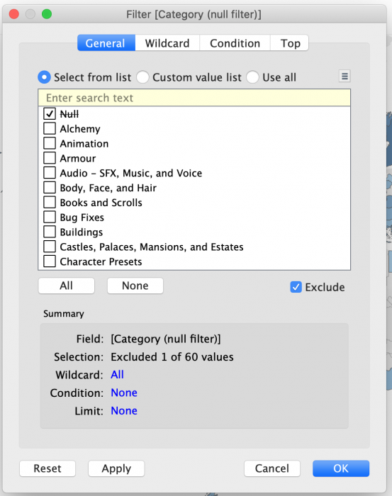
- Click OK.
You may notice that Null is still displayed on the worksheet's category filter. The issue is that the Category filter is currently displaying all possible values from the dataset, even if there are no values and it is therefore irrelevant.
- Click the arrow at the top right of the category filter.
- Choose Only Relevant Values. Because Null is filtered out, it is no longer a relevant value.
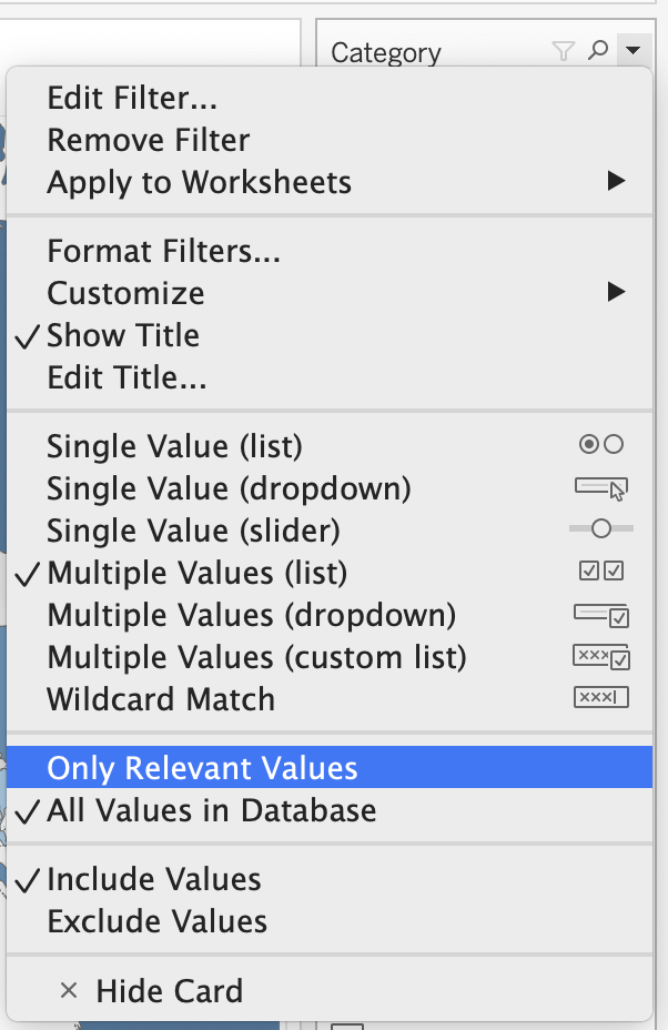
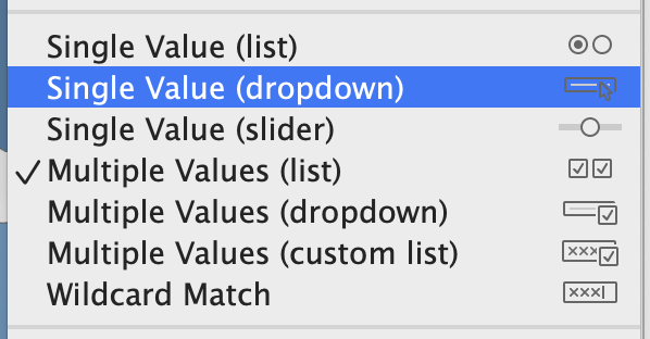
- Click the arrow again and take a look at the options above Only Relevant Values, ranging from Single Value (list) to Wildcard Match. These are the choices for how we display our filter. Our options would be slightly different if we had continuous, rather than discrete (categorical) data.
- Choose Single Value (dropdown). This will be the most effective for what we are showing.
- If the dropdown defaults to Alchemy you may want to set it to All instead so you can see all the data as we continue working with it.
As you can see, the dropdown takes up a lot less space than the list of checkboxes.